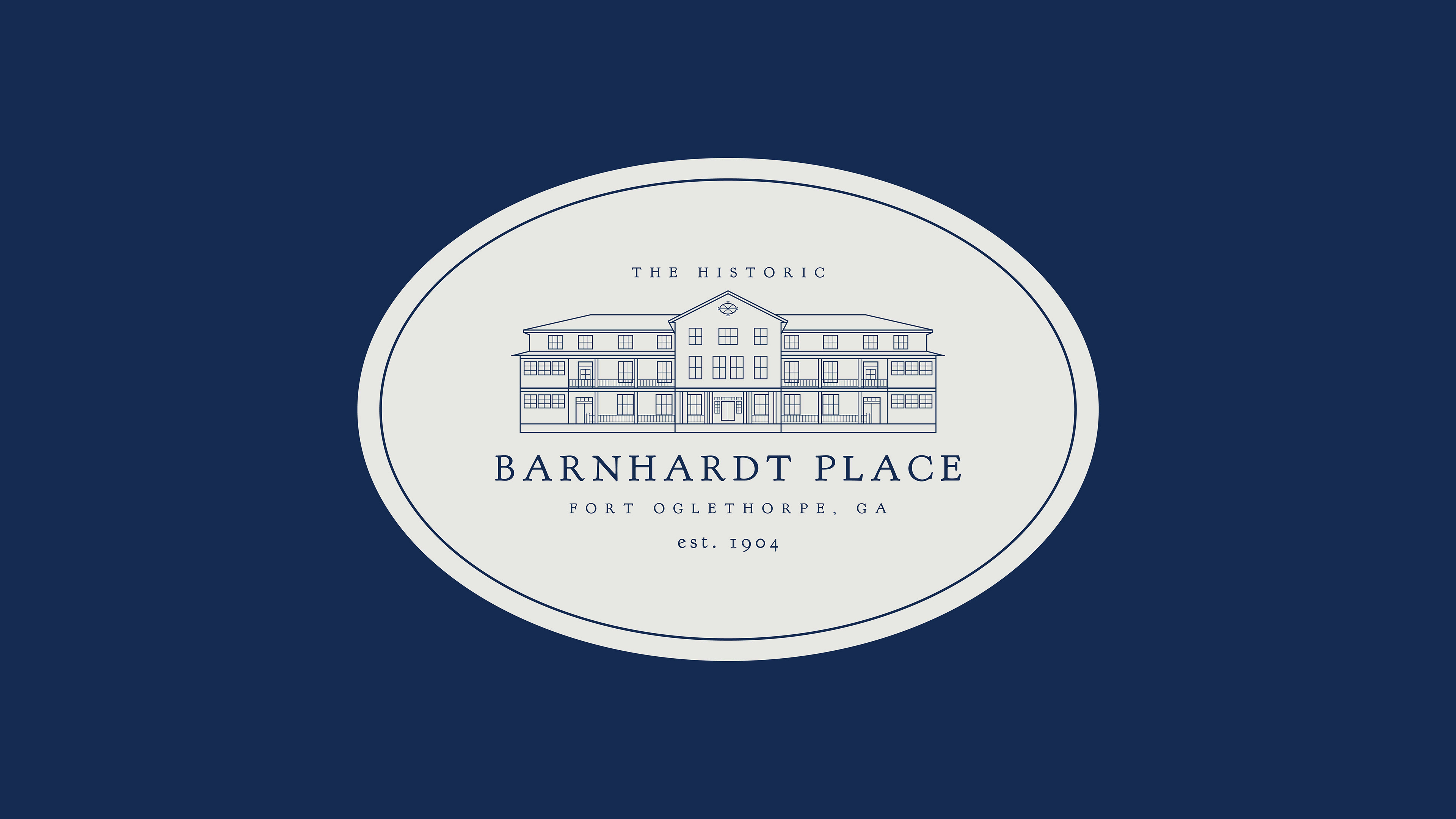
Developing an identity for a building that is over a century old deserves ample time and painstaking detail in order to capture the heart of a place so many souls have called home. The process began by documenting the iconic oval sign and white facade, photographs which would shape the foundation of the brand. Using the facade as the bones, the emerging logo was meticulously carved out the shape of structure. Once paired with a revised oval shape to pay tribute to the original sign, the design was brought to life with colors that reflect the passage of time and battles long since fought.